
.png)
Bloom is an app that connects its users to a community that provides reliable, healthy, and locally grown sources of food at the nearest farmers' markets.
Duration: 4 Weeks
Tools: Figma, Photoshop, Illustrator, Zoom, Maze, Slack
Team: Alysia, Sam, Daniel
My Role: Preparation of Interview Guides, Conducting a User Interview, Research, Competitive and Comparative Analysis, Visual and Interaction Design, Prototyping, and Usability Testing.

INTERVIEW
GUIDE
Mind mapping proves to be an invaluable tool for brainstorming topics related to farmers' markets. We utilized it to gather inspiration for crafting the user interview guide.the user interview guide.
INTERVIEW
We conducted remote interviews with three participants via Zoom, recording the sessions and converting them into transcripts for later use in synthesizing the data.
AFFINITY
MAPPING
Using affinity mapping, we synthesized the data from our interviews to identify trends that could later be translated into Persona & Problem Statements, aiding our understanding of users' behavior.

PERSO
NA
Camilla is a persona we constructed based on data and trends we gathered and synthesized using affinity mapping, aiding our comprehension of Bloom's User Behaviors. While collaborating with others, as anticipated, tension arose among designers. We encountered this challenge while synthesizing our data and advocating for our own creative ideas. It is easy to become entrenched in our individual perspectives, but with the guidance of our instructors providing a third-person viewpoint, we managed to overcome these barriers. This allowed us to find a middle ground and merge our comprehensive collective ideas, resulting in the development of this persona.
Camilla
28 - Austin, TX - Bartender
She’s new to Austin and struggling to meet new people. She has visited Farmer’s Market in the past in order to connect with people, learn more about her city, and buy delicious local food, but not sure where to start looking in Austin, TX, and doesn’t know anyone to ask.
Behaviors
-
Friendly and outgoing loves to chat with new people
-
Tech and social media savvy
-
Tries to volunteer a few times a year
Goals
-
Deepen knowledge of her new neighborhood
-
To be able to shop locally and conscientiously
Needs
-
A fun place to meet new people
-
A better understanding of where local products come from
-
A low-pressure environment in which to grow and explore
Pain Points
-
Has a car, but has a hard time finding parking in an unfamiliar downtown space
-
Doesn’t know the city well enough to know where she might like to hang out or meet people
USER FL
OW
Considering Camilla's behavior, we crafted a user flow to illustrate her journey using the Bloom app, starting from the beginning to the end of the happy path, which involves receiving directions to her chosen Farmers Market or vendor location.

MID-FI
PROTOTYPE
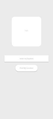
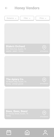
After gathering ideas, we constructed wireframes using Figma, which later evolved into Mid-Fi Prototype Usability Tests to ensure that we were developing a user-friendly product.
SKETCH
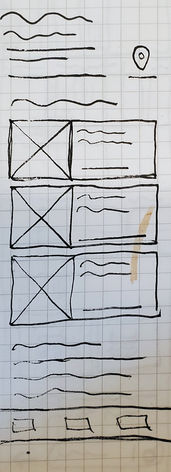
Taking Camilla's needs and behaviors into consideration, we began sketching ideas for features that we wanted to include in the app. These features would assist Camilla in navigating through the app, completing her happy path, and locating food vendors at a local farmers market.


Despite being separated by locations and facing limited time constraints, we successfully conducted four remote moderated usability tests with participants who met Bloom's persona criteria and user demographic. For the testing, we utilized tools such as maze.io and Zoom.
During the tests, we assigned tasks to participants, provided directions for navigating the prototype, and invited feedback on their experience with the prototype. We collected and synthesized the data from these usability tests, yielding the following findings:
1
When users were prompted to search for a vendor, most of them clicked on the search bars, unaware that they were inactive in this prototype.
4
Most users were confused by the task of connecting with a vendor because they thought they had to click a heart icon to do so.
2
The navigation flows smoothly overall, but there are some minor issues. Users encountered difficulties when attempting to navigate back or return from certain pages.
5
Half of the users were greatly frustrated by the low visibility of the text and colors in our Mid-Fi Prototype.
3
All users successfully navigated through all frames with ease. Half of them commented that the icons were intuitive and familiar.

I took the lead on creative decisions for this project while maintaining a collaborative approach, consistently exchanging ideas and feedback with each other.
The direction we pursued aimed to evoke the "friendly local vibes" experienced when visiting a stand at a Farmers' Market. Some of our interviewees expressed feeling intimidated by the unfamiliarity of Farmers' Markets, so I opted for a nature-inspired color palette inspired by outdoor scenery. This choice aimed to create a soothing and calming atmosphere reminiscent of hiking trails, along with the rustic charm of Farmers' Market stands adorned with baskets, burlap, and organic produce.
For typography, I selected Fraunces & Nunito. These fonts reminded me of old chalkboard signs found in traditional town markets, offering a blend of decoration and contemporary readability. This choice aimed to align with the theme of the color palette while ensuring accessibility and readability.

COLORS


TYPOGRAPHY


HI-FI PROTOTYPE
We regarded the feedback and insights from our usability tests with utmost seriousness, utilizing them as guiding principles for our design decisions during the iteration process of our hi-fi prototype. Additionally, we incorporated the creative direction outlined in the previous section and introduced interactive elements into the app. These enhancements aimed to bolster visual engagement between users and the app while making the interface more intuitive and user-friendly.


