


DONE.
Since July 2022, I have been working closely with the marketing team at Done. as their freelance designer. I support the team by contributing to a variety of design projects, including print and digital marketing materials, social media posts, and landing page design. Done. is a telehealth company that aims to provide support and assistance to patients with ADHD.
Work: Marketing Collaterals, Social Media, Motion Graphics, UI Design
Tools: Figma, Canva, Webflow, Adobe After Effects
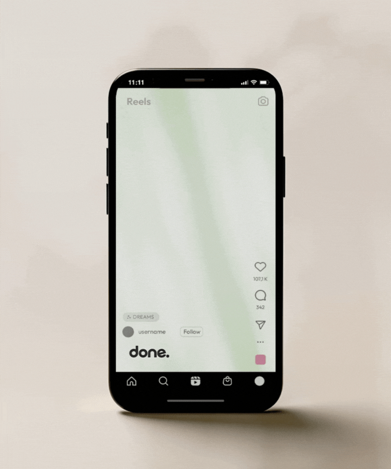
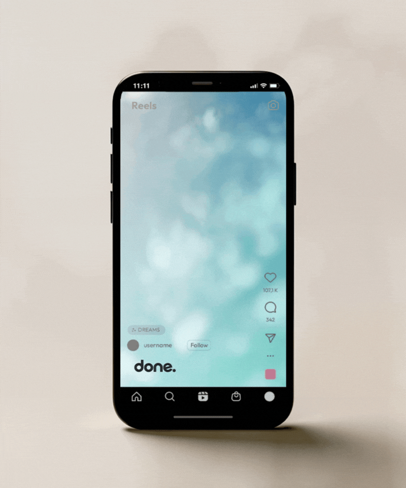
Focused on maximizing organic growth, engagements, and branding through social media posts in this project, the challenge lay in navigating strict brand guidelines while capturing users' attention.
To overcome this, my design approach employed grid systems to maintain visual consistency while accommodating varied content. By exploring intriguing compositions, we ensured that each post stood out within the brand's aesthetic framework.
Additionally, I leveraged complimentary color schemes between photo assets and backgrounds to enhance visual appeal and convey information effectively. This strategic blend of design elements aligned with the brand's identity and successfully garnered attention and fostered meaningful engagements, leading to significant organic growth across social media platforms.


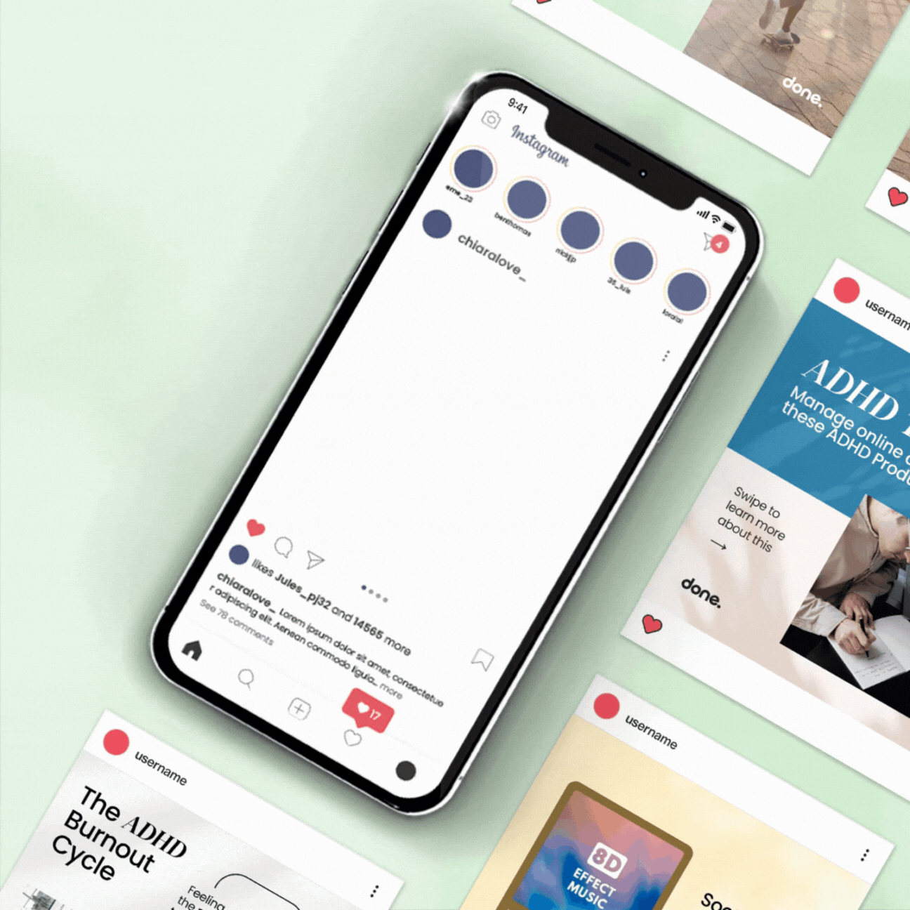

In this digital and print advertisements project, Done. was targeting the acquisition of new customers and members while boosting profits through the introduction of special promos and offerings.
Trying to get user attention, my design strategy centered on incorporating interactive motion design elements to infuse dynamism and captivate the audience across both digital and print mediums.
By strategically highlighting compelling calls-to-action (CTAs) and showcasing enticing promotions and offerings prominently within the ads, in collaboration with Done. marketing team we effectively navigated the balance between brand consistency and engaging content.
This approach not only ensured that our designs aligned seamlessly
with the brand identity but also facilitated enhanced user engagement and conversion rates, resulting in tangible growth in customer acquisition and revenue generation.


Done.'s marketing team aimed to enhance engagement and drive sales in this email design project, and as a designer my challenges included creating a stand-out email in crowded inboxes while maintaining brand consistency.
My design solutions involved creating visually appealing, mobile-responsive templates with eye-catching graphics, concise copywriting, and prominent CTA. Personalization elements were integrated for enhanced relevance.
Results showed an increase in open rates, click-through rates, and conversion rates, demonstrating the effectiveness of user-centric design in achieving marketing objectives.


I was focusing on creating a modular, versatile, accessible, and user-friendly design in this presentation slides project, my approach centered on simplicity and ease of use. I opted for a neutral color palette to allow for easy replacement and editing of assets, ensuring adaptability for different users and contexts.
The slides were designed to be minimalistic yet impactful, with a focus on clarity and accessibility. Each slide was crafted to be easily editable, requiring only text adjustments while maintaining a cohesive and professional look. This approach resulted in a set of presentation slides that were not only visually appealing but also highly functional, meeting the design objective of creating a versatile and user-friendly design.


Aimed at improving SEO through informational content about ADHD while boosting conversion rates, I found working with strictly text-based content a bit challenging. My design strategy focused on enhancing accessibility and readability by carefully adjusting text size and paragraph length to ensure optimal legibility and user engagement while at the same time adhering to strict brand guidelines.
I adopted a modular approach, allowing sections to be easily interchangeable to accommodate different content requirements while maintaining a cohesive theme. To increase conversion rates, we strategically highlighted the call-to-action (CTA) buttons with eye-catching colors, drawing users' attention and encouraging action.
This approach resulted in a series of landing pages that not only met SEO goals but also effectively guided users towards conversion, showcasing the impact of thoughtful design in achieving marketing objectives within brand constraints.


